Resizing an image in CSS is a fundamental skill every web designer should know how to do. Though it seems like one of the common issues most face, especially beginners, the good news is that it’s much easier than one thinks. The right guidance and techniques make resizing images become second nature quickly.
Whether you are using CSS to adjust images so your website is responsive, optimize the page load speed, or make the layout look attractive, CSS offers all the tools you need. The proper resizing of images is essential to ensure that your website looks professional and functions perfectly on all devices.
By the end of this blog, you’ll know how to change size of image in CSS. You’ll understand why and when to resize images and how to do it.
1. What Does it Mean to Change Size of Image In CSS?
In web development, you can change size of image in CSS, so that it is larger or smaller, without affecting the file size. You can figure out how large or small an image is in its containing container by changing the width, height, and other sizing attributes within your CSS code.
Resizing an image appears relatively simple, but web development projects often have unique use cases and approaches to the resizing of images. Ultimately, it depends on what you want to achieve through resizing – either responsive design, performance optimization, or enhancing user experience. Now, let’s find out why resizing images is an important part of web development.
2. Why is Resizing Images in CSS So Important?
The importance of resizing images cannot be overstated. When you properly resize images on your website, you can:
- Improve loading speed: Large images are slow to load, thus slowing your website. Resize the images to reduce the load time and improve performance.
- Make it responsive: The nature of a responsive web design means that the images need to change according to various screen sizes. The proper resizing of the images will ensure great images on desktop, tablet, and mobile devices.
- Make it visually appealing: Images that do not fit in their containers will mess up your page layout. Resizing images in CSS ensures they fit exactly into your design.
This is a very essential skill for any web designer: understanding how to adjust image size in CSS.
3. How To Change Image Size In CSS: The Basics
Before we talk about resizing images, here are a few basic concepts we need to know:
- Width and Height: These are the most commonly used attributes for image resizing in CSS. They let you specify the dimensions of an image in pixels, percentages, or any other unit of measurement.
- Aspect Ratio: An aspect ratio is a ratio of the width of an image to its height. When the width is changed without altering the height proportionally, the image may be distorted.
- Container Size: Sometimes images are contained in a container on a webpage, such as a div. When the div is resized, the image changes size with the change of the div.
4. How Can I Make a Picture Smaller in CSS?

If you ask a question such as “How to change the size of an image in CSS?” – the answer’s very simple indeed: you can minimize an image in size either by lowering width or height.
Here’s a simple example:
The image will here be resized according to 50% of its original width in order to produce an aspect-ratio that means the height, which automatically maintains.
If you want the image to resize to a specific pixel size, you can set both width and height in pixels:

5. Using the Width and Height Properties to Resize Images
The most basic way to rescale an image in CSS is by using width and height. Setting the width and height defines how big the dimensions of the picture are. These properties can contain values in the form of pixels, percentages, or other measurement units.
Example 1: Resize Image with Fixed Pixel Values

This code directly resizes the image to 500px by 300px.
Example 2: Resize the Image as a Percentage of Its Container

This method is great for responsive web design, where the image size adjusts based on the container’s size.
You May Also Like: Website Design Tools: Costs, Features, and Budget Guide
6. The Max-width and Max-height Properties for Flexibility
You mostly want the image to resize automatically, but you only want it within certain limits. That’s where max-width and max-height properties are helpful so that an image does not cross certain dimensions.
For instance:

This ensures that the image will resize dynamically based on the size of its container, but it will not grow beyond the specified maximum size.
7. Using the Object-fit Property for Resizing Images
The object-fit property is another handy property that allows you to resize images. This will let you determine how an image fits inside its container, preserving the aspect ratio of the image.
Here’s how it goes:

Object-fit Values:
- Cover: The image will cover the entire container without getting stretched, and some parts may get cropped from the image.
- Contain: This will fit within the container leaving no space cropping, but around it, space will be observed.
8. How to Use the Scale() Function to Resize Images
You can use the scale() function to scale an image by a given factor. Compared with directly setting the width and height, this will preserve the aspect ratio of the image and make the transformation smooth.
Here’s an example:

The scale() function is great for adding smooth animations or hover effects, as it allows you to scale the image smoothly.
9. How to Resize Images with Media Queries for Responsiveness
You can apply media queries in CSS to make sure that your images look good on all screen sizes. Media queries are applied because different styles have to be applied depending on the screen size of the device. Therefore, making your images responsive.
Here’s an example:
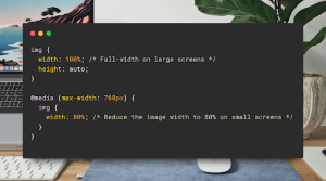
In this example, the image will take up 100% of its container’s width on larger screens but only 80% on smaller screens, such as mobile devices.
10. Common Mistakes to Avoid When Resizing Images in CSS
While resizing images in CSS is easy, there are some common mistakes to watch out for:
- Aspect ratio forgotten: Ensure the width and height of the image are proportional at all times, so distortion doesn’t occur.
- Stretching images too much: Don’t stretch small images to big sizes because they end up pixelating.
- Performance is not considered: Large images, even when resized in CSS, can slow your website down because their file size may be too large. Optimize your images first before uploading them.
11. How to Stretch Images in CSS
If you want to stretch an image to fill its container, you can set both the width and height to 100%:

However, be careful when using this method, as it can distort the image. It’s best used when the image is flexible enough to stretch without losing quality.
Conclusion
A skilled web developer or designer needs to know how to change size of image in CSS. Using different approaches adjusting the width and height or applying the max-width and max-height properties through scale() or object-fit-there are infinite ways of fine-tuning any image according to design needs. Whether you are creating a desktop layout or a mobile-friendly design, CSS provides the flexibility to make your images look responsive, nice, and effective. With these techniques, images can easily be fit into designs without compromising the quality or performance.
We are assisting growing businesses by building websites and mobile applications. Have a look at our portfolio to see how you can be successful.
Our technical support team is available to address questions on 24/7 basis. contact us today!
FAQs
How can I make a picture smaller in CSS?
You can change size of image in CSS by adjusting the width and height properties. This allows you to control the image size directly about its container or specific dimensions.
- How to change the size of an image in CSS?
You can change the size of an image in CSS by adjusting the width and height properties using css change size of image. - How can I make a picture smaller in CSS?
To make a picture smaller, use css shrink image by setting smaller dimensions with max-width or width. - How to resize an image in CSS for responsiveness?
For responsive images, apply css resize image with max-width: 100% and set height to auto. - How do I stretch images in CSS and HTML?
Stretch images using css stretch image by defining both width and height to fill the desired space. - How to scale an image in CSS without distortion?
Use css scale image by setting proportional width and height values to maintain aspect ratio.