You want pages that line up clean, scale fast, and look modern on every screen. A good grid does that. WordPress now gives you grid support in core. You can ship equal-width columns, tidy gaps, and responsive behavior without tangling custom CSS on every page.
This guide covers what ships in WordPress, how to enable it, where the editor’s Grid blocks help, which plugins add power, and how developers can push further.
You will also see what the community is doing in the wild. If you need help implementing any of this, our team at Pure Website Design builds and maintains production grids every week.
Why Grid Layout Matters for Real Sites
A grid keeps structure obvious. It controls rhythm, whitespace, and flow. Your content becomes easier to scan. Your pages feel consistent. That matters for blogs, stores, portfolios, and product landing pages.
A solid wordpress grid layout also reduces design debt. You set rules once. You repeat them with confidence.
Modern grids must do three things. They keep equal-width columns as content changes. They adapt at tablet and mobile breakpoints without breaking the design.
They play well with blocks and templates so teams work faster. Core grid support in WordPress now covers that base.
What Changed in Core and When
Grid support launched in the Gutenberg plugin in version 15.5. It later shipped in WordPress 6.3 as a variation of the Group block. It is still evolving and marked experimental in places, but it is ready for real layouts with the right setup
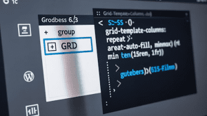
That grid variation uses CSS Grid under the hood. The default rule sets equal columns with this pattern: grid-template-columns: repeat(auto-fill, minmax(min(15rem, 100%), 1fr)). This gives you equal tracks that wrap as space allows. It is robust on desktop, tablet, and mobile.
How to Enable Native Grid in Your Site Theme
There are two clear ways to enable native Grid. One is quick and suited for testing, the other is stronger for production use. Both give you flexibility inside the block editor.
Switch it on in Gutenberg experiments
This method is simple and fast. It is ideal when you want to test grid layouts on a staging site without custom code.
- Install the Gutenberg plugin from WordPress.org.
- Open Settings in the editor, then go to Experiments.
- Enable the Grid variation for the Group block.
- Insert a Group block and choose Grid from the options.
Register a custom Grid variation in your theme
This method is best for production sites. It gives you stable defaults, better control, and consistency across templates.
- Create a block-variations.js file in your theme.
- Register your custom Grid variation programmatically.
- Use enqueue_block_editor_assets to load it in the editor.
- Apply consistent naming, defaults, and version control for teams.
Pure Website Design uses the second approach for client builds. It keeps layouts predictable during updates and WordPress maintenance cycles.
How the Core Grid Variation Behaves
You get a Group block that behaves like a grid container. Drop blocks inside it. The grid assigns equal tracks and flows items row by row. The CSS pattern above makes the tracks flexible.
As the viewport shrinks, columns reduce, then stack. Editors do not need to write CSS. The UX feels familiar, with standard toolbar controls and sidebar settings you already know.
You can extend this in templates. The Post Template block supports grid layouts for lists of posts, products, or custom post types.
Add block styles for borders, hover states, and spacing. Use UI controls for gaps and alignment to fine tune density on each template.
Where the Editor’s Grid Blocks Fit
WordPress.com ships a Layout Grid block that many teams like. You can add it from the inserter or type the /layout shortcut. It exposes clear grid controls and a breakpoint model that matches typical design systems.
Desktop uses 12 columns, tablet uses 8, and mobile uses 4. You can set spans, offsets, and gutters. Content stays crisp as you resize.
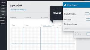
The Grid block also acts as a container variation in the editor. You can toggle between Group, Row, Stack, and Grid.
The toolbar lets you transform, align, and move blocks. The sidebar includes layout mode, position options like sticky, and advanced fields for anchors and custom classes. This helps designers prototype fast without custom CSS.
A WordPress.tv workshop walks through practical placement and styling for the Grid block. You see how creators arrange items, manage gaps, and handle responsive spans in real time. The workflow is straightforward for editors, even those new to CSS.
How to Display Posts in a Grid Without a Plugin
Use the Query Loop block, then switch the layout to Grid View. This gives you a posts grid you can style in the editor. You control query parameters, card content, and basic spacing. It is the simplest way to build archive pages, home sections, or category grids.
This method scales. You can drop it into block templates and keep styles in theme JSON. It works well for editorial teams and stores that lean on WordPress eCommerce plugins with custom post types mapped into loops.
When you Might Want a Grid Plugin
The editor grid is strong for layout structure. Sometimes you want more. A plugin can add masonry, justified rows, filtering, load-more, and media sources beyond the media library.
Start with the Automattic Layout Grid Block plugin if your team likes column-based layouts with tablet and mobile options, plus adjustable gutters. It stays close to editor patterns, so onboarding is fast.
For galleries, portfolios, and post grids, you will find free and premium options. ULTIDA maintains a broad roundup of grid plugins covering masonry, justified layouts, filtering, and rich media support. It is a good scan to pick a fit for your site.
If you use advanced marketing stacks, plan for integrations. Your grid should mesh with analytics, forms, and the best WordPress CRM plugin you use to track leads from content blocks.
Developer Options that Go Past the Basics
Core ships an __experimentalGrid component in @wordpress/components. It offers props for columns, rows, gaps, alignment, and display modes.

You can render grid layouts in custom blocks with predictable spacing and responsive behavior. Treat it as a moving target, and pin versions when shipping to production.
You can also combine CSS Grid for macro layout with Flexbox for micro alignment. This is a common pattern for cards inside a grid.
Use Grid for the container, then Flex for card content alignment, badges, and button rails. FASTDOT explains how Grid and Flexbox work together in theme code, with examples tied to real responsive rules.
For lists of posts, create Query Loop variations with a grid Post Template. Predefine inner blocks and layout. This gives editors a one-click grid that follows your system.
If you are building a wordpress grid at scale, keep rules in theme JSON, register stable variations, and test with real content. Your future self will thank you during release days.
Community Insights from Real Sites
Creators on Reddit, confirm the basics. WordPress includes a simple Grid block. You can create grid layouts with the Query Loop in block theme templates. That gets many sites to a clean result fast.
Users who want minimal grid galleries often start with built-in blocks, then adopt a plugin when they need masonry or filters. Reddit threads show this path often, with teams using Query Loop grids for posts and a gallery plugin for media.
This aligns with what we see in client work. Most publishing grids run well in core. Media-heavy sites add a gallery plugin for speed and control.
Practical Editor Workflows that Keep Teams Fast
Use these steps on a new landing page or archive.
- Insert a Group block and transform it to Grid. Set columns to Auto. Add a gap that matches your system spacing. Keep it consistent with theme JSON.
- Drop your content blocks inside. Use headings, paragraphs, and images sparingly. Short content wins.
- For a posts grid, add a Query Loop. Choose Grid. Trim the card to title, featured image, and one meta line. You can add a button if the design calls for it.
- On WordPress.com, use the Layout Grid block when you need explicit spans, offsets, and the 12-8-4 breakpoint model. It is easy for editors to reason about.
- If your team needs sticky sections, use the position control in the Grid or Group settings. Use it for short callouts, not long blocks.
If you rely on drag and drop WordPress page builders, you can still define the outer page in core and hand over sections to your builder. Keep grids at the template level. That gives you speed and control without locking the whole page to a builder.
How Grids Support Commerce and Lead Flow
Product tiles, category hubs, and content blocks all live on grids. Good structure makes revenue pages easier to scan.
If you run a store, keep product cards consistent and short. Use a posts grid for editorial content that supports buying decisions. Tie your forms, popups, and CRM to those blocks. Your grid becomes part of your funnel.
This is where a stable template and a solid WordPress theme help. Your cards carry consistent classes for tracking, testing, and UI tweaks. If you run subscriptions or bundles, test grids against your WordPress eCommerce plugins to confirm templates and hooks are aligned.
Pure Website Design builds these flows with simple patterns. We focus on maintainable layouts and clean data for analytics. If you need help planning templates, we offer affordable WordPress website design and ongoing WordPress maintenance for teams that want predictable results.
When You Should Use a Plugin Over Core
Use a plugin if you need one or more of these features today.
- Masonry or justified layouts for media heavy pages
- Client-side filters, AJAX pagination, or infinite scroll
- Video support inside grid cards with lightbox support
- Tight control over spans and offsets at each breakpoint with presets
WordPress.com’s Layout Grid is a quick win for column control. For galleries and media, review plugin roundups and pick a tool that supports your design and workflow.
FAQs
How do you make a posts grid without plugins?
A posts grid is easy with the Query Loop block. Switch its layout to Grid View and set the number of columns. Style the cards with theme JSON or block settings for spacing, borders, and text display.
What happens if I use a grid plugin instead of core?
Using a plugin adds features like masonry, justified rows, and filters. These extras help with galleries or portfolios. The trade-off is extra code and possible performance load, so plugins should be chosen with care.
Why should I use a custom grid variation in my theme?
A custom variation provides stability and consistency across templates. It allows developers to lock in naming, spacing, and defaults. This avoids design drift and gives editors a reliable pattern every time.
How do you control spacing between grid items?
Spacing is handled with grid gaps in the container, not with margins on individual blocks. Defining gaps in theme JSON ensures consistency across layouts. This keeps the design system clean and predictable.
What if I need help building a grid system for my site?
Help is available from experts who work with WordPress grids daily. Pure Website Design builds affordable WordPress website design projects with structured layouts. The team also manages updates and maintenance for long-term reliability.
Why does my grid layout break on mobile?
Grid layouts break on mobile when columns are fixed instead of flexible. Using auto-fill and minmax rules allows columns to shrink and stack naturally. Testing on multiple devices confirms that grids behave as expected.
How can you mix CSS Grid and Flexbox together?
CSS Grid defines the outer container and controls track layout. Flexbox handles alignment inside each card, like centering text or placing buttons. Combining both creates a system that works across all screen sizes.
Where do I find reliable support if my WordPress grid fails?
Reliable support comes from developers who understand block themes and core features. Pure Website Design offers WordPress maintenance and fixes layout issues fast. This keeps sites stable while editors continue to create content.
Final Thoughts
Grids give WordPress sites order, balance, and flexibility. Core support now makes it easier to design equal-width, responsive layouts without relying on heavy code or complex plugins.
When you need more advanced layouts, plugins and custom components extend what is possible. The best approach is to keep your setup simple, predictable, and aligned with your design system.
If you want expert help building a consistent grid structure, our team at Pure Website Design can handle it. We create affordable WordPress website design, manage WordPress maintenance, and deliver layouts that scale with your content and business goals.